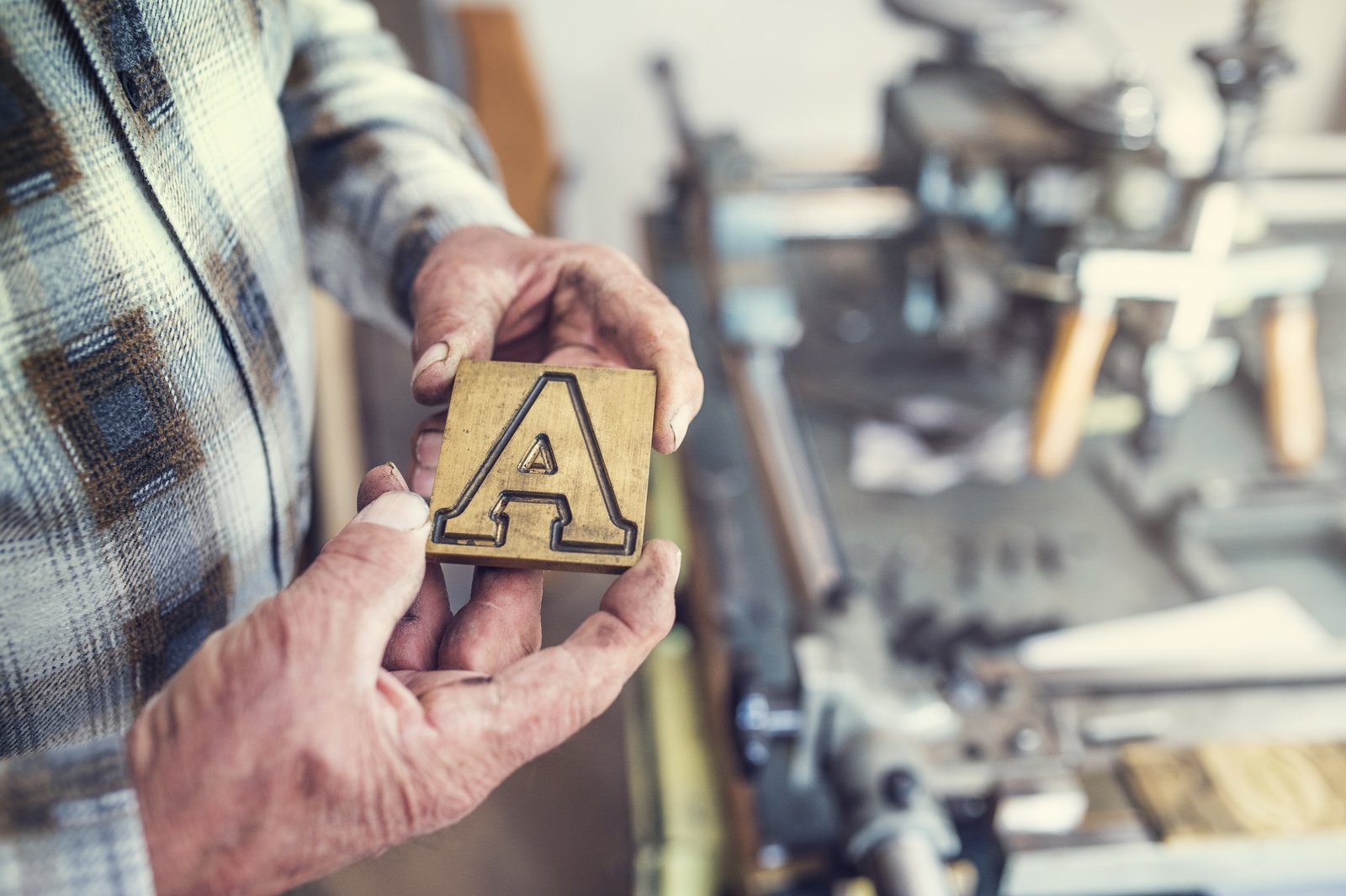
I’ve watched countless photography businesses fail at the same place: their fonts.
You invested in better cameras, perfected your lighting, and built a stunning portfolio. Then you slap Comic Sans next to Helvetica on your website and wonder why clients book your competitor instead.
Typography matters more than most photographers realize. Your font choices communicate professionalism—or desperation—before a single image loads. I’m talking about the difference between attracting premium clients and fighting for scraps at $300 per session.
The Pairing Problem
After reviewing dozens of photographer websites and marketing materials, I’ve identified the six mistakes that consistently undermine your brand positioning.
Mistake #1: Choosing fonts that scream the same thing. Two bold, attention-grabbing fonts create visual chaos. Your headline and body copy should have a clear hierarchy, not compete for dominance.
Mistake #2: Ignoring readability for personality. That trendy script font looks gorgeous in your logo—tiny. But at body copy size on a client’s phone? Unreadable. Clients leave. You lose the session.
Mistake #3: Mixing too many typefaces. I see photographers using four, five, sometimes six different fonts across their brand. This screams “I have no design system.” Stick to two—maximum three if you really know what you’re doing.
Mistake #4: Pairing fonts from the same family. Two sans-serifs that look nearly identical? You’ve wasted the opportunity to create visual contrast. One serif, one sans-serif usually works better.
Mistake #5: Forgetting about brand personality fit. Wedding photographers using edgy, aggressive fonts. Commercial photographers using delicate, feminine scripts. Your typography should align with the clients you actually want.
Mistake #6: Testing only on desktop. 65% of your traffic is mobile. A font pairing that looks beautiful on your monitor might be completely illegible on an iPhone 12. Test everywhere.
What This Means for Your Bottom Line
Strong typography isn’t decoration—it’s a conversion tool. Photographers with consistent, professional branding see 33% higher inquiry rates according to design studies I’ve reviewed. That’s not coincidence.
Your font choices tell potential clients whether you’re serious about your craft or just dabbling. They communicate value before you ever discuss pricing.
Take Action Today
Audit your website, business cards, and social graphics. Do your fonts work together intentionally, or did you just pick what looked cool?
Start with one reliable serif and one clean sans-serif pairing. Make it consistent across everything. Watch your brand perception—and your booking rate—improve.
Comments (1)
I tried this on a client project yesterday and the results were way better than expected.
Leave a Comment